Design Tokens & Variables: What I Actually Learned Building Them
Design Tokens & Variables: What I Actually Learned Building Them
Design Tokens & Variables: What I Actually Learned Building Them
You set up your components. Colors look consistent. Spacing feels right. Then a new designer joins the team and suddenly there are 12 different shades of blue, margin values that nobody can explain, and a rebrand project that takes three weeks instead of three hours. The root cause? No tokens.
Design Tokens & Variables: What I Actually Learned Building Them
I used to think tokens were something you set up when the system gets big enough.
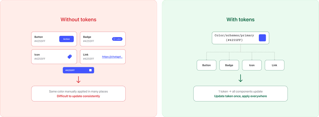
Then I had to rebrand a product. Changed the primary color. Spent two days hunting down every hardcoded #1A73E8 across 60 components - and found 11 slightly different blues that were supposed to be the same one.
That was the last time I worked without tokens.
What are design tokens, really?
A token is just a named value that stores a visual decision.
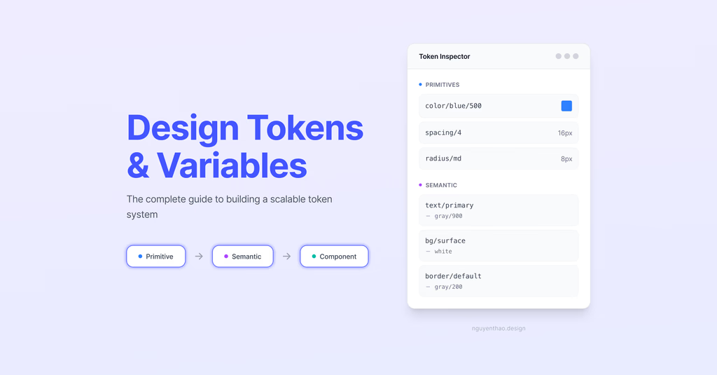
Instead of #1A73E8, you have color/brand/primary. Instead of 16px, you have spacing/4. Every component, every screen references the name - not the raw number. Change the value once, everything using it updates.
That's it. The concept is genuinely that simple. What trips most people up is structuring them well, which is where I spent the most time learning.
Tokens vs. Figma Variables Tokens = the concept, the methodology. Figma Variables = the tool to implement them natively (since mid-2023). Before that, teams used plugins like Tokens Studio or JSON files synced to code. Now you can do most of it inside Figma, and push to code via the Variables REST API.
The 3-layer structure, and why each layer exists
Most broken token systems I've seen skip a layer they needed, or add one nobody asked for. Here's the structure that actually holds up:
Layer 1 - Primitives: what exists
Your full raw palette. Every color stop, every spacing unit, every type size. No meaning attached - just values.
One rule I follow without exception: hide primitives from the Figma library. Right-click the collection → Edit variables → uncheck "Show in all supported properties." If designers can pick them directly, they will - and your semantic layer becomes decoration.
Layer 2 - Semantic: how it's used
This is where the real work happens. Semantic tokens don't hold values - they alias primitives, and that alias changes per mode.
This is what makes dark mode a mode switch, not a redesign. It's what makes a rebrand a one-afternoon job instead of a two-week sprint.
Naming rule: always name by intent, never by value. color/text/danger is correct. color/red It is not, because the moment that red changes to orange for accessibility reasons, the name breaks and misleads everyone using it.
Layer 3 - Component: where it's used
Scoped tokens for a specific component. I don't create these for everything, only when a component needs to be themed independently from the rest of the system.
In a simple single-brand system, you might rarely need this layer. In a multi-product or white-label environment, where one component needs to look completely different per brand, this layer is essential, and you'll wish you had it from day one.
The question everyone asks: when do you actually need semantic tokens?
My honest take after building several systems:
You need them if you have or realistically plan to have more than one mode. Light/dark, brand A/brand B, compact/comfortable density, or platform-specific themes. The moment you need to change a value only in one context, semantic tokens are the only clean solution.
You can skip them if you're a solo designer, single brand, small system (under ~30–40 distinct values), and no developer handoff. Primitives alone work fine here.
The real signal isn't team size or token count. It's this thought: "I need to change this color, but only in dark mode." The moment that thought appears, you need the semantic layer. Add it before the pain compounds - retrofitting semantic tokens into an existing system is significantly harder than building them in from the start.
Typography, spacing, and radius - the parts people underestimate
Color gets all the attention. But these three are where inconsistency quietly accumulates across sprints.
Spacing is where I've seen the most drift in real projects. Designers start with a solid 8pt grid, then one component needs 13px, then another needs 22px, and six months later, nobody can explain the system anymore. My fix: commit to base-4 (spacing/1 → 4, spacing/2 → 8, spacing/4 → 16, spacing/8 → 32), and treat any value that doesn't fit as a signal to revisit the layout - not a reason to add a new token.
The payoff: once component padding uses spacing tokens, you can add a Compact density mode in minutes. Remap the spacing values for that mode, and every component becomes denser without touching a single component directly.
Typography is multi-dimensional in a way that a single font-size token can't solve. Size, weight, and line-height interact - a font/size/lg token used on body copy and on a heading will feel inconsistent even if the size is identical. What I do: define primitive size/weight/line-height values, then create semantic text role tokens (text/body/md, text/heading/lg) that combine them. More setup upfront, but components reference roles - not raw numbers - which makes the whole system easier to explain and maintain.
Border radius is the one people most often skip semantic tokens for - and then regret it. A radius/full on buttons gives a completely different brand feel than radius/sm. If your product has any chance of a brand evolution or white-label requirement, set up radius/component/button and radius/component/card as separate semantic tokens early. It costs almost nothing to add, and avoids a painful component audit later.
What I actually do on a new project
Not the ideal workflow - what I realistically do first:
Start with color, always. Highest visual impact, most visible inconsistency. Get the primitive → semantic → mode pipeline working for color before touching anything else. If that part is solid, the rest follows naturally.
Set up one mode even if you only need one. A single "Default" mode in Figma costs nothing. Adding a second mode later is just adding a column to an existing collection. Starting over without modes means touching every token you've already created.
Don't pre-build component tokens. I create them as I need them, not before. Building 200 component tokens before any real components exist is wasted effort. If your semantic layer is well-structured, most components won't need component-specific tokens at all.
Test on your hardest component, not a button. After building the token structure, I apply it to the most complex existing components in the system: a data table, a multi-state card, and a form with validation states. If the tokens hold up there, the structure is solid. If they don't, it's better to know now.
The audit always comes first. Before creating a single token, I open the most-used design file and count: how many distinct colors? How many spacing values in use? There's almost always more chaos than expected - and that chaos tells you exactly what your primitive set needs to cover.
Resources I actually use
Guide to variables in Figma - the foundation, start here
Tokens, variables, and styles course - Figma's own walkthrough built around a real product example
Variables playground file - hands-on practice, worth an hour
Tokens Studio - when you need JSON sync with code, or token management that goes beyond what Figma natively supports
Tokens aren't the glamorous part of design systems work. Nobody's going to notice your beautifully structured semantic layer. But they'll notice when a rebrand ships in one afternoon - while another team is still on week two of their find-and-replace.
Build the foundation right once. Your future self - and every designer and developer who touches the system after you - will feel the difference every sprint.
Building a token system in your project? Drop a comment - I read all of them and am happy to dig into specifics.