Nexus: Trusted Messenger
Nexus
Mobile app
2026
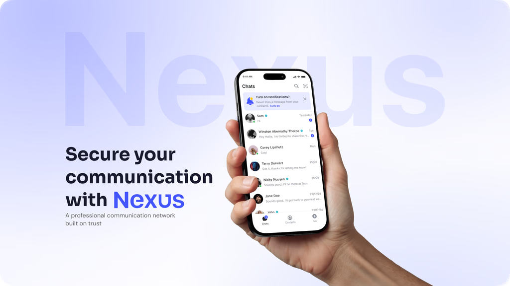
Nexus is a trust-first OTT communication app built for consumers, SMEs, and OEM governments. At its core is a KYC-verified identity layer that makes every conversation feel safer — every message you send comes from a real, verified person.
My responsibility was designing the 1:1 chat experience from scratch: the conversation list, the chat screen, the message composer, and the full set of message and conversation actions. This was the most user-facing part of Phase 1 MVP — if it felt clunky or unfamiliar, no one would trust the product, no matter how strong the backend was.
My Contribution
As the sole UI/UX Designer, I owned the end-to-end design of the 1:1 chat experience — Nexus's core feature for Phase 1 MVP.
Researched chat app patterns and user behavior to inform design decisions
Translated product requirements into wireframes and high-fidelity UI
Designed conversation list, chat screen, message states, and composer
Defined flows for message actions (reply, react, copy, edit, delete, pin) and conversation actions
Applied and extended B3Networks design system components for mobile
Collaborated with PO to refine requirements and scope
Supported engineers and QA during development and design handoff
The Challenges
How do you build a messaging UI that feels immediately familiar to users, while being distinctly different from WhatsApp or iMessage, and scalable enough to grow into a B2B product?
Three constraints shaped every decision:
1. E2EE (end-to-end encryption) architecture Because Nexus uses end-to-end encryption, chat history lives on-device only. There's no server-side message retrieval. This means the UI needs to surface security transparently without making it feel like a liability, users need to understand why messages won't transfer automatically, without hitting a wall of technical jargon.
2. Scalability to B2B While Phase 1 targets consumers, the long-term roadmap includes SME business accounts and RCS integration. Every component decision: bubble layout, action patterns, composer behavior,… needed to work at scale, not just for casual chats between friends.
3. User Habits from Existing Apps Research on chat behavior showed that users have deeply ingrained mental models from WhatsApp, iMessage, and Telegram. Deviating too far from these patterns causes friction; staying too close risks feeling derivative. The challenge was finding the right point of differentiation.
Design Goals
Create a chat experience that feels familiar, simple, and easy to adopt for users who already have strong messaging habits from apps like WhatsApp, iMessage, and Telegram
Make Nexus’s trust-first value visible through interface structure and interaction patterns, instead of relying on heavy technical explanation or excessive security messaging
Communicate key product principles such as verified identity, privacy, and end-to-end encryption in a way that feels clear, calm, and user-friendly
Keep the messaging flow intuitive and lightweight in the MVP, while ensuring the core patterns can scale into future use cases such as SME accounts, richer communication flows, and business messaging needs
Build a strong foundation for a chat product that is not only usable in the short term, but also flexible enough to support future growth, more advanced actions, and broader product expansion

Given Solutions
1. Message Actions
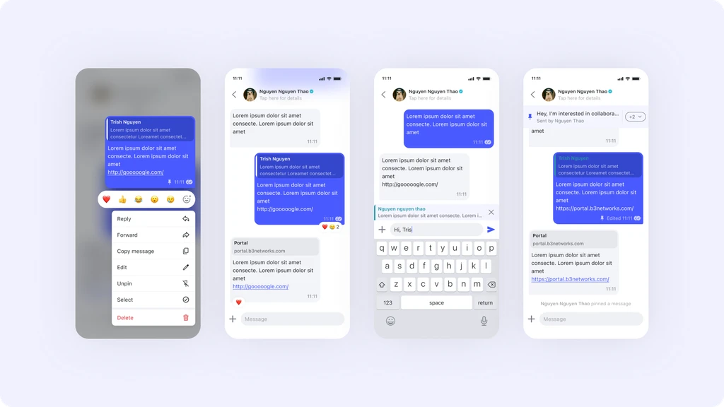
The feature list required 9 message-level actions: Edit, Reply, Copy, Delete, Forward, Pin, React, Multi-select, Mark as Read/Unread. Fitting these into a mobile UI without overwhelming users was the hardest problem to solve.
Options explored:
Approach | Pros | Cons |
|---|---|---|
iOS-style context menu | Familiar, lots of space for actions | Feels disconnected; interrupts visual flow |
Bottom sheet | Clear hierarchy, easy to extend | Too heavy for quick actions like copy/react |
Inline toolbar + overflow menu | Fast for common actions; progressive disclosure for advanced | Requires careful prioritization of what's "common" |
Decision: A long-press triggers a floating action bar with the top 4–5 most-used actions (React, Reply, Copy, Delete + overflow for the rest). This follows established mobile patterns so users don't have to learn new gestures, while keeping the interface clean at rest.
2. Trust Indicators
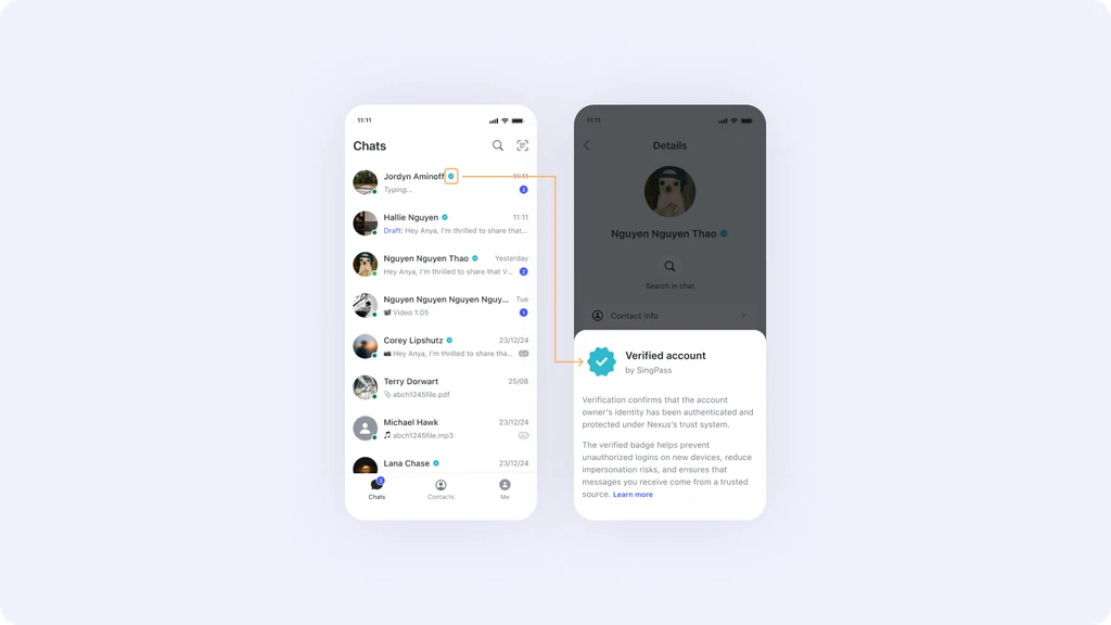
Nexus’s key differentiator is its trust layer. However, surfacing a “Verified” badge at message level would feel intrusive and visually repetitive — especially if it appeared next to every message.
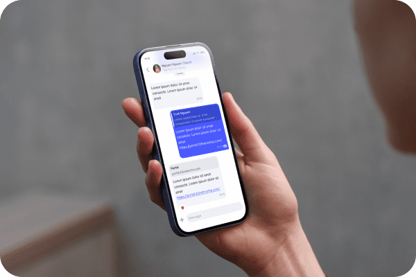
Decision: Trust is shown at the conversation level, placed in the header next to the contact name, rather than at the message level. The E2EE status is presented once at the top of the chat as a lightweight informational message, paired with a lock icon and a Learn more link. After that, it remains silent.
This approach follows familiar messaging patterns, helping users recognize trust signals naturally without adding cognitive load.
3. Conversation List: Balancing Scan Speed and Context
The conversations list needs to work for both light users (few chats, big text) and power users (many chats, dense information). The standard pattern: avatar + name + preview + timestamp, but we added:
Delivery status in the list (not just inside the thread), so users know at a glance if their last message was read
Unread filter chip at the top for Phase 2 (stubbed in Phase 1's design to keep the pattern consistent)
Preview truncation at one line to keep the list readable at density
4. Composer
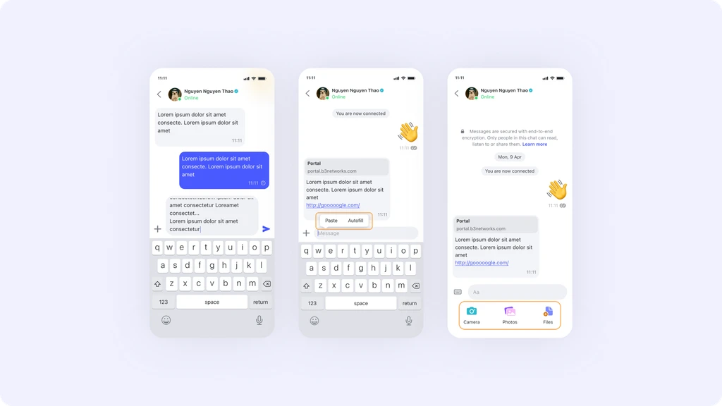
The composer includes text, emoji, file attachment, and camera access. Text input + one "attachment" icon that expands into the full option set. Emoji is accessible via the system keyboard. Camera shortcut appears as a persistent icon next to the attachment menu.
5. Message States
Four delivery states: Sending → Sent → Delivered → Read. The decision was how to visualize these without making every tick/checkmark feel like a surveillance system (a common complaint users have about WhatsApp's double-blue-tick).
Decision: Use subtle icon variants (single tick, double tick, filled double tick) placed inside the message bubble's timestamp row. The icons are small and low-contrast enough to be scannable - not prominent enough to feel like a read receipt countdown clock.
The "Seen" status visibility is also a user-controlled privacy setting, which was already established in the product spec. This means the UI for read receipts needed to gracefully degrade - seen ticks can be hidden per-user preference, so components never hard-depend on that state being shown.
The Design


What Set Nexus Apart
Working on Nexus made me think carefully about what trust means as a UX property - not just a security property.
In most apps, trust is handled by the backend: encryption, authentication, server security. The UI's job is to stay out of the way. Nexus is different because the trust layer - SingPass KYC verification - is a user-facing feature. It's something users actively seek out and value. That changes the design problem significantly.
The SingPass integration means that when a Singaporean user opens Nexus and sees a verified badge next to someone's name, they know that person has gone through the same identity verification process they use for their CPF account or their HDB application. That's a much stronger trust signal than a green dot or a "verified" checkmark from an unknown source.
Designing for that - making that signal feel natural, ambient, and appropriately weighted - was the most interesting design challenge in this project.